Your mind and machine learning, the base rate effect
Machine Learning
Mental Models
Author
Dominik Lindner
Published
March 12, 2025
1 The Intersection of AI, Bias, and Human Nature
Discussions about bias and discrimination in artificial intelligence (AI) are growing louder. Critics argue it is unethical for technology to display discrimination. However, this critique often overlooks a fundamental truth: technology reflects the humans who create it.
2 The Human Touch in Technology Design
So far, no technology has surpassed the limitations of its creators. History provides countless examples for discriminatory technology, for example, tools for right-handed individuals, inadvertently disadvantaging the left-handed population. The better alternative would have been designing for omni-dexterity, but the biases and norms of the time limited such foresight.
Similarly, AI and machine learning (ML) systems are shaped by the data they are trained on. Since humans select this data and curate it, the data carries the biases—conscious or unconscious—of its creators. And even if no selection is done, all available sources of the world are just an expression of human prejudices. The expectation that AI is inherently unbiased ignores the deep biases of humans.
3 How Human Bias Mirrors AI
Instead of looking at the bias of AI, let’s instead focus on the human prejudices and biases.
Our intuitive brains, much like clustering algorithms in ML, categorize entities and events based on repeated exposure. Over time, this leads to the formation of stereotypes, which serve as mental shortcuts to navigate a complex world.
For example, imagine data represented as clusters of points on a graph. A machine learning algorithm groups similar points together, forming clusters that define categories. If new data appears outside these clusters, the model struggles to make sense of it. Humans experience a similar cognitive disruption when encountering events or behaviors that don’t fit their existing worldview.
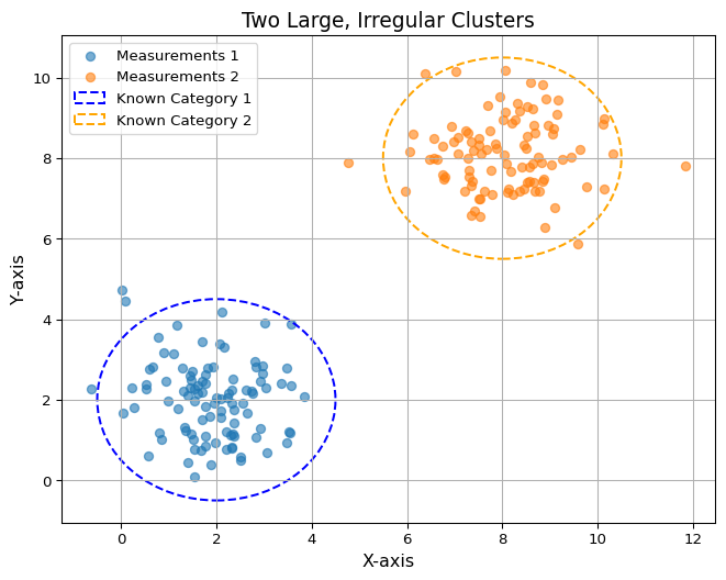
3.1 Initial bias
Imagine two dense clusters of points on a graph. These represent established categories or stereotypes based on limited data.
Show code
import numpy as npimport matplotlib.pyplot as pltfrom matplotlib.patches import Ellipse# Generate data for two large, irregular clustersnp.random.seed(42)cluster1_x = np.random.normal(2, 1, 100)cluster1_y = np.random.normal(2, 1, 100)cluster2_x = np.random.normal(8, 1, 100)cluster2_y = np.random.normal(8, 1, 100)# Plotting the clustersplt.figure(figsize=(8, 6))plt.scatter(cluster1_x, cluster1_y, label="Measurements 1", alpha=0.6)plt.scatter(cluster2_x, cluster2_y, label="Measurements 2", alpha=0.6)# Adding ellipses to highlight clusterscluster1_ellipse = Ellipse((2, 2), width=5, height=5, edgecolor='blue', facecolor='none', linestyle='--', linewidth=1.5, label="Known Category 1") cluster2_ellipse = Ellipse((8, 8), width=5, height=5, edgecolor='orange', facecolor='none', linestyle='--', linewidth=1.5, label="Known Category 2")# Add ellipses to the plotplt.gca().add_patch(cluster1_ellipse)plt.gca().add_patch(cluster2_ellipse)# Adding titles and labelsplt.title("Two Large, Irregular Clusters", fontsize=14)plt.xlabel("X-axis", fontsize=12)plt.ylabel("Y-axis", fontsize=12)plt.legend()plt.grid(True)plt.show()
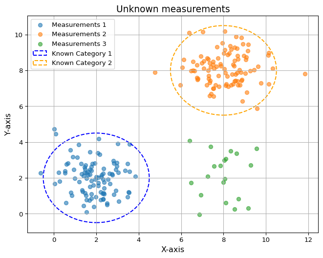
3.2 Encountering the unfamiliar
A few smaller, isolated measurements appear. These represent data points that challenge existing categories, much like unexpected experiences disrupt human assumptions.
Show code
import numpy as npfrom matplotlib.patches import Ellipseimport matplotlib.pyplot as plt# Generate data for two large, irregular clustersnp.random.seed(42)cluster1_x = np.random.normal(2, 1, 100)cluster1_y = np.random.normal(2, 1, 100)cluster2_x = np.random.normal(8, 1, 100)cluster2_y = np.random.normal(8, 1, 100)cluster3_x = np.random.normal(8, 1, 20)cluster3_y = np.random.normal(2, 1, 20)# Plotting the clustersplt.figure(figsize=(8, 6))plt.scatter(cluster1_x, cluster1_y, label="Measurements 1", alpha=0.6)plt.scatter(cluster2_x, cluster2_y, label="Measurements 2", alpha=0.6)plt.scatter(cluster3_x, cluster3_y, label="Measurements 3", alpha=0.6)# Adding ellipses to highlight clusterscluster1_ellipse = Ellipse((2, 2), width=5, height=5, edgecolor='blue', facecolor='none', linestyle='--', linewidth=1.5, label="Known Category 1") cluster2_ellipse = Ellipse((8, 8), width=5, height=5, edgecolor='orange', facecolor='none', linestyle='--', linewidth=1.5, label="Known Category 2")# Add ellipses to the plotplt.gca().add_patch(cluster1_ellipse)plt.gca().add_patch(cluster2_ellipse)# Adding titles and labelsplt.title("Unknown measurements", fontsize=14)plt.xlabel("X-axis", fontsize=12)plt.ylabel("Y-axis", fontsize=12)plt.legend()plt.grid(True)plt.show()
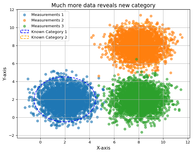
3.3 Broader perspective
Expanding the dataset reveals larger, more inclusive measurement clusters. These reflect a refined understanding, showing how more diverse exposure can reshape biases and improve predictions.
Show code
import matplotlib.pyplot as pltimport numpy as npfrom matplotlib.patches import Ellipse# Generate data for two large, irregular clustersnp.random.seed(42)cluster1_x = np.random.normal(2, 1, 3000)cluster1_y = np.random.normal(2, 1, 3000)cluster2_x = np.random.normal(8, 1, 3000)cluster2_y = np.random.normal(8, 1, 3000)cluster3_x = np.random.normal(8, 1, 3000)cluster3_y = np.random.normal(2, 1, 3000)# Plotting the clustersplt.figure(figsize=(8, 6))plt.scatter(cluster1_x, cluster1_y, label="Measurements 1", alpha=0.6)plt.scatter(cluster2_x, cluster2_y, label="Measurements 2", alpha=0.6)plt.scatter(cluster3_x, cluster3_y, label="Measurements 3", alpha=0.6)# Adding ellipses to highlight clusterscluster1_ellipse = Ellipse((2, 2), width=5, height=5, edgecolor='blue', facecolor='none', linestyle='--', linewidth=1.5, label="Known Category 1") cluster2_ellipse = Ellipse((8, 8), width=5, height=5, edgecolor='orange', facecolor='none', linestyle='--', linewidth=1.5, label="Known Category 2")# Add ellipses to the plotplt.gca().add_patch(cluster1_ellipse)plt.gca().add_patch(cluster2_ellipse)# Adding titles and labelsplt.title("Much more data reveals new category", fontsize=14)plt.xlabel("X-axis", fontsize=12)plt.ylabel("Y-axis", fontsize=12)plt.legend()plt.grid(True)plt.show()
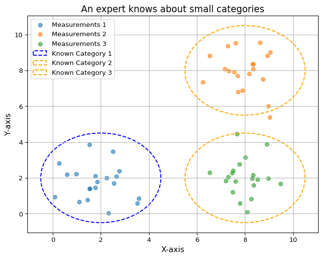
A Human, trained about the 3 categories, would correctly classify the following data points.
Show code
import numpy as npfrom matplotlib.patches import Ellipseimport matplotlib.pyplot as plt# Generate data for two large, irregular clustersnp.random.seed(42)cluster1_x = np.random.normal(2, 1, 20)cluster1_y = np.random.normal(2, 1, 20)cluster2_x = np.random.normal(8, 1, 20)cluster2_y = np.random.normal(8, 1, 20)cluster3_x = np.random.normal(8, 1, 20)cluster3_y = np.random.normal(2, 1, 20)# Plotting the clustersplt.figure(figsize=(8, 6))plt.scatter(cluster1_x, cluster1_y, label="Measurements 1", alpha=0.6)plt.scatter(cluster2_x, cluster2_y, label="Measurements 2", alpha=0.6)plt.scatter(cluster3_x, cluster3_y, label="Measurements 3", alpha=0.6)# Adding ellipses to highlight clusterscluster1_ellipse = Ellipse((2, 2), width=5, height=5, edgecolor='blue', facecolor='none', linestyle='--', linewidth=1.5, label="Known Category 1") cluster2_ellipse = Ellipse((8, 8), width=5, height=5, edgecolor='orange', facecolor='none', linestyle='--', linewidth=1.5, label="Known Category 2")cluster3_ellipse = Ellipse((8, 2), width=5, height=5, edgecolor='orange', facecolor='none', linestyle='--', linewidth=1.5, label="Known Category 3")# Add ellipses to the plotplt.gca().add_patch(cluster1_ellipse)plt.gca().add_patch(cluster2_ellipse)plt.gca().add_patch(cluster3_ellipse)# Adding titles and labelsplt.title("An expert knows about small categories", fontsize=14)plt.xlabel("X-axis", fontsize=12)plt.ylabel("Y-axis", fontsize=12)plt.legend()plt.grid(True)plt.show()
This is called the base rate effect. It is easily understandable when talking about categories and groups. But this base rate is also at play when we evaluate a quantity and decide whether it is good or bad.
4 Bridging Bias: AI and Human Learning
AI bias stems from incomplete data, just as human stereotypes arise from limited exposure. Traveling to unknown places or interacting with unfamiliar cultures challenges our mental models. Think about your last holiday in an exotic location, the surprising design of a toilet or the local customs around everyday activities. These experiences reveal the narrowness of our perspective and force us to recalibrate.
For AI, this recalibration occurs by diversifying training data and refining algorithms to account for underrepresented groups or scenarios. For humans, it requires intentional exposure to diverse perspectives.
5 How better AI development and ethics can improve society
Rather than seeing AI bias as uniquely outrageous and fearing the effects of AI, we should view the opportunity as a chance to improve our own behavior.
By acknowledging and addressing biases in ourselves and in the systems (AI or traditional) we create, we can strive for a more fair and inclusive society.
Like this post? Get espresso-shot tips and slow-pour insights straight to your inbox.